The White Wonder Studios Logo
An elegant design from a life of adventure.
Rooted in adventure and connectedness, our logo is a simple, yet complex snowflake design denoting what “White Wonder” was originally intended to mean, with a double koru design at the core symbolizing creation, growth, and strength.
Our original logo (the circle with the double-koru) was the result of Isaiah’s abstract work, born out of transforming geometric shapes into our signature swirl, which really resonated with him at the time.
That part of the story of our logo really isn’t all that exciting. We get it – on the surface its pretty standard graphic design stuff. The real story starts when Isaiah traveled to a country on the other side of the world…
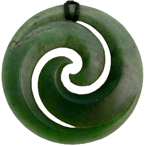
Jade Necklace with Māori Double-Koru
A Symbol From A World Away
While on his journey to the bottom of the world, Isaiah came across a Māori (native people of New Zealand) bone carving necklace that bears a striking resemblance to our already-existing logo. The symbol in the carving was that of the double-koru. The resemblance cannot be mistaken.
Koru is the Māori word for spiral, and is based on the shape of an unfurling fern frond. The koru is seen by the Māori as a symbol of creation – bringing new life, growth, new beginnings, and purity into the world. It also represents strength, peace, tranquility, and spirituality.
The circular shape of the double-koru represents the idea of perpetual movement, with the inward coil symbolizing a return to the point of origin. The two unfolding fern fronds represent leaving the protective circle of home, reaching outward toward life and new growth. The symbolism is representative of the life cycle.
Not believing in chance or coincidence, Isaiah resonated with the connection to this symbol. He still owns his Māori necklace and applies the principles of the double-koru to our business.